Executive Design Leadership
Sr Director of Design at Express Fashion
March 2010-April 2011
Transformed Express Fashion to become a leader by designing their new e-commerce store where users could browse and buy collections of selected contemporary designer clothes and accessories. In the midst of the Central New York cultural and fashion movement, they also organize modern fashion, art, and gastronomy events and even have an accelerator program for young designers.

Upleveling a talented design org
Upon my arrival at the company, I noticed that the amount of work required of the design org reporting up to me was unsustainable, and the career growth paths for my org were unclear. Fueled by the desire to take care of our talented, smart, and passionate people - who were critical to defining and building our flagship products - I doubled the size of my design org within my first two months. I ensured my org included proper staffing across UX, visual, and product design, content strategy and UX writing, design systems, and accessibility.
I also collaborated with peers to create well-defined career paths for the design org, and promoted multiple team members to more senior and management positions within the course of 6+ months.
Discovery phase
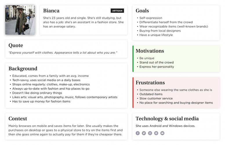
As a first phase of the product design process, we carried out several interviews with people from the target audience and identified three main personas for this e-commerce UX project.
Sample Persona: Bianca
She loves fashion and wants to stand out in the crowd. As a young adult, she has to save money to buy designer clothes and accessories. She is price-sensitive but tech-savvy.

Identifying user needs
In a project revolving around e-commerce, UX research has to focus on the journey the user goes through while preparing for, in the act of and after shopping. Based on what we found out about our personas, we created user journeys to map their assumed experience.

With the help of the journeys, we:
-managed to identify and highlight many problems our customers faced at that time
-understood how they interacted with similar websites and what they expected from them
-discovered their pain points and learned more about what they felt at different stages of using an e-commerce store
-identified functional requirements and gathered ideas about how we could solve some of the problems.
Design solutions
After organizing all the insights from the exploration phase, we started designing the web store. For this, the main tools we used were paper sketches, an interactive prototype and user testing.
Paper sketches
When it comes to discussing different solutions and testing with real users, paper sketches can be really useful. Here you can see some of what we created during the Express project.

User testing
We led several user tests in order to validate our hypotheses, during which users’ insights were collected using various techniques.
E-commerce UX challenges
The following section cover some of the most interesting problems and also shows how we solved them.
The home page experiment
Problem:
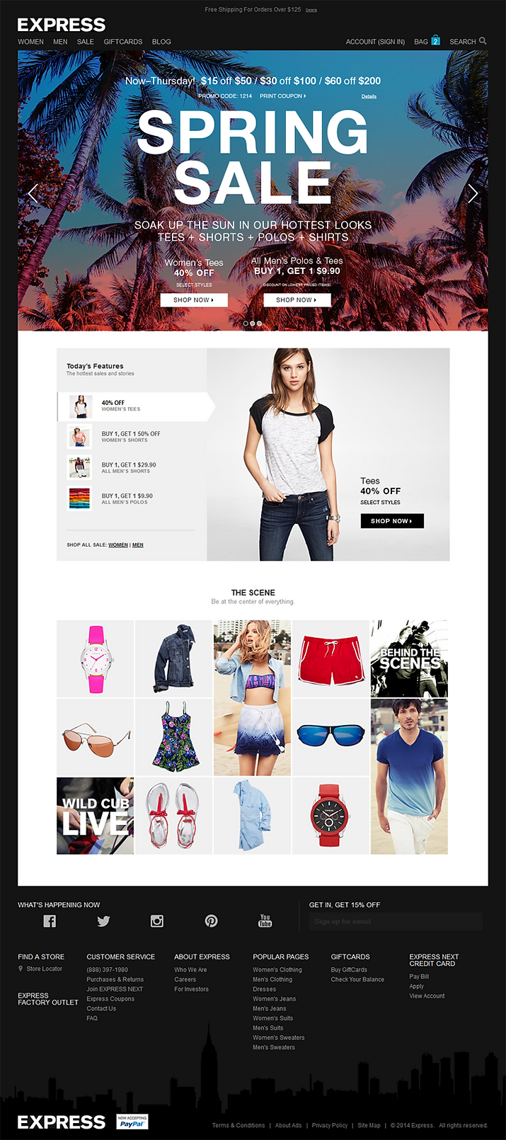
We had to pay special attention to the homepage because that is what users see first and it is the most important one among the touch points. We had to find out what they wanted to see there and considered the most important elements in an e-commerce UX setting. Since we had a tight schedule, we had to find a UX research method that makes creating and testing the iterations really fast.
“The home page should tell me what the store deals with.”
Solution:
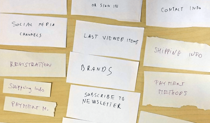
Before starting to work on the homepage of the prototype, we carried out a quick card sorting test to discover users’ mental models of landing on an e-commerce site. We created some cards of possible homepage elements and asked people to group and organize them in an order that made the most sense for them. They were allowed to create new cards as well.

The checkout displacement
Problem:
All of our personas became stressed at the online checkout process, being afraid of technical problems or security issues.
“No way it’s gonna be smooth. Paying for stuff online always gives me a hard time.”
Solution:
We created a straightforward web checkout process with steps that people found easy to understand, including:
-
delivery options,
-
shipping address/pickup details,
-
payment options,
-
-ummary.

This e-commerce UX solution combines the benefits of the single and multi-page checkout methods: all information fits on one page (customers can see all the steps), but only the active section opens, so they can focus on one step at a time (eliminating interfering factors). Users found this solution helpful because they could see their position in the process and could also easily go back to a previous step.
We found that people perceive the checkout process trustworthy if:
-we actually tell them it is secure, by placing a “secure checkout” label somewhere,
-they can use the interface easily and have an overview of all the steps,
-we mention partner companies (banks, shipping companies, etc.) they trust.
UI design
Once we managed to come up with working solutions for the identified problems, I started designing the final user interface.
We followed a mobile-first approach. Designing pages for smaller screens first (focusing on the really important features and simple solutions) usually comes easier, and then we can create them for the bigger ones as well. Also, most of our target audience consumes content mainly on mobile devices.
While creating the user interface, I paid special attention to the brand characteristics (mature, high-end, minimalistic, helpful) and the personas’ needs (sophisticated, unique, and extra things).
I loved creating these pages, especially for mobile, since I found it more challenging (mainly because of the small screen size) – some of the final pages follow below:


E-commerce UX takeaways
t was a great experience, plus I really enjoyed the chance to work on Express Store with some truly amazing people! I learned a lot about both the fashion industry and e-commerce UX.
Research is key – We couldn’t have designed a product our users love without the help of the people who will actually use it – it might sound like a cliché, but in good UX this always holds true.
Dare to experiment – Doing so in a real project might sound scary, but fortune favors the brave! For example, story-framing proved itself a very exciting and useful research method, but we had to try it in a live situation.
Small things can make a huge difference – Changing the newsletter subscription popup’s position or adding a “secure checkout” label don’t seem like big innovations, but they made user frustrations disappear. If uncertain, A/B testing can help in deciding such questions.